October 24, 2018
Let content inform the design
What is Intrinsic Web Design?
In 2011, Responsive Web Design changed the way we interact with the web. The emerging use of mobile devices forced Designers and Developers to step away from their desktops and think about web development on a smaller scale. Responsive Design has allowed us to stay connected while on the go and helps us quickly digest large content sets in a condensed and user-friendly way.
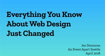
Responsive Design was only the beginning of the shift in designing for mobile-first/mobile-friendly experiences. In 2018, Jen Simmons, a designer supporter at Mozilla, spoke at the A List Apart Event in Seattle and the topic of her speech was, “Everything You Know About Web Design Just Changed”. This title was intriguing and a bit jarring, but once she explained that websites are more than a layout and began talking about a new approach to web design (Intrinsic Design) – we were all ears!
Responsive Design Versus Intrinsic Design
Responsive Design was coined by Ethan Marcotte eight years ago; this was a big shift in the web world at the time. Marcotte defined Responsive Design as utilizing a fluid grid and media queries to change the design at different break points in order for the design to fit and display well on both mobile and desktop screens. Responsive Design squashed the “fixed width” and “tables” concept that many of us learned in HTML 101.
Technology is ever evolving, even the newest techniques like Responsive Design were bound to grow and progress over the years – meet “Intrinsic Design”. The word, “Intrinsic” means belonging to the essential nature or constitution of a thing. In the web world, Intrinsic Design allows our Designers more creative freedom when they design new user interfaces by letting the content determine the layout. There are many similarities, as well as differences between Responsive and Intrinsic Design capabilities:
- Responsive Design uses flexible images which shrink and grow depending on the size of their container, while Intrinsic Design allows you to use flexible images as well as fixed images so the content decides which approach is best.
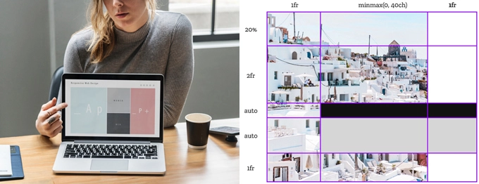
- Responsive Design uses fluid columns to effectively utilize all screen real estate regardless of screen size; Intrinsic Design uses fluid columns as well as rows to provide Designers and Developers with more flexibility.
- Responsive Design uses media queries to adjust screen sizes for different breakpoints, while Intrinsic Design does not need to rely on media queries.
Responsive Design paved the way for Intrinsic Design to come to fruition, Intrinsic Design is basically Responsive Design but running on four cups of coffee. By using emerging CSS modules like Flexbox and CSS Grid Layout; Designers can now properly layout their designs the exact way they want them to be laid out while avoiding hacky code or third-party frameworks to make it work.
Digital Art and the User Experience
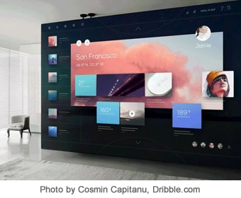
Intrinsic Design allows both Designers and Developers to think outside of the normal breakpoints they are used to and take the user experience to the next level. More flexibility to design means user interfaces are more than just a layout; they are digital art that users can interact with. Now Designers and Developers can REALLY use white space intentionally and squish, stretch or shrink elements as they see fit to produce an end product that truly speaks to users regardless of their device of choice.
Here are some examples of sites that are using Flexbox to effectively reorganize site content in unique ways when you alter the size of the browser window:
We are excited about Intrinsic Design and all of the artistic freedom that it allows our Design team to explore. We appreciate the respect that Intrinsic Design supports the medium of the web, it is not a newspaper or Word document – it is interactive and dynamic. If your site needs a redesign, it is best that you consider Intrinsic Design approaches to make your content shine regardless of the device and resolution you are using; after all, the content is what is bringing users to your site in the first place.
Resources
There are a lot of Intrinsic Design and layout resources available for you to explore:
Helpful Web Tips & Tricks
Start Your Project