February 8, 2017
Ten highly recognized companies updated or compeletely redesigned their logos in 2016. We continue to see a trend with logo modernization becoming more minimalistic and favoring a flat design. Below are before and after images of logos from some of the most recognizable companies; what do you think about the updated logos? Do you think the minimilistic and flat design trend will continue into 2017?
#10. Uber
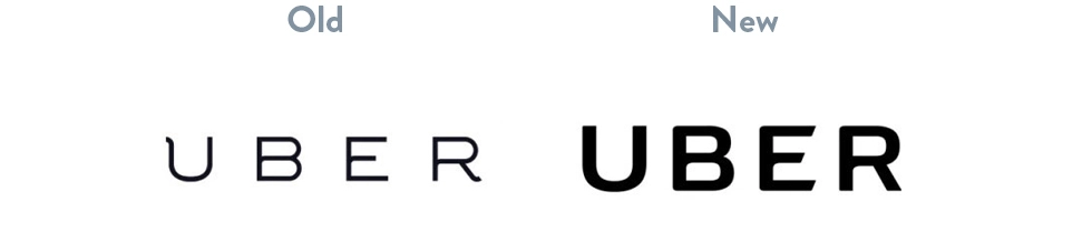
Uber has become a very well known brand across the country for quick and easy travel. They spent 2016 internally updating their logo to have a heavier font weight with less space (kerning) between each letter. Although the change is subtle, their design team went through a thorough process updating not only the logo but their app icon as well. You can read more about the design evolution and process here.
#9. Peace Corps
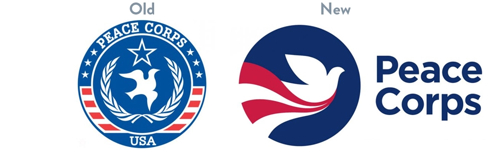
Peace Corps has been around since 1961 and desperately needed to modernize their logo. They successfully updated their logo to incorporate a fresh design and font. They amplified their color palette by using more saturated blues and reds that lean closer to purple which gives the logo a brighter look. Peace Corps kept their flat design and minimized the amount of texture, ultimately leaving the “seal” look behind. What you do you think about the new logo? The bird actually looks like a dove now!
#8. US Soccer
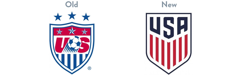
U.S. Soccer enlisted Nike to redesign their logo which hadn’t been updated in 20 years! The new look remains flat and its simplistic look will continue to be relevant as long as the flat design trend sticks around. Announcing a new logo to your customers can be tricky to get them onboard, many people just don’t like change. U.S. Soccer took a unique approach by posting a video announcing their logo change.
#7. Instagram
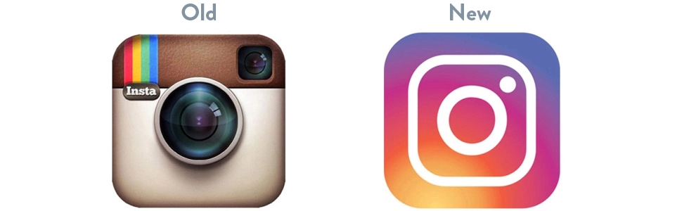
Instagram has become wildly popular with younger and older generations alike. Last year they went through a major logo rebranding by flattening their camera logo and filling it with colorful gradients, similar to a tie-dye effect. We’re not sure that either logo is remarkably impressive but the new logo definitely stands out, especially on a phone screen.
#6. Netflix
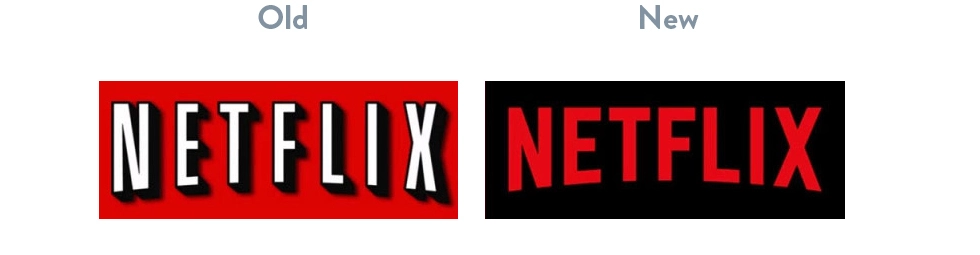
Netflix updated their logo by removing the thick black stroke around the font and nixed the dropshadow. If you look closely, you can see that they chose a similar font with heavier weight and width. They also decided to change the font color to red. What do you think about their new flattened logo?
#5. Pandora
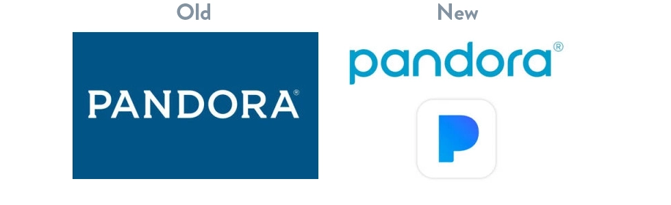
Pandora also joined the logo redesign bandwagon last year by refreshing their logo. They changed the font from all caps to all lowercase letters and they also chose a lighter shade of blue. Just like Instagram, they filled the trademark with a fun blue gradient, is this the beginning of the new “unflat” design? One addition that stood out is they made their registered trademark symbol much larger; a little too large…
#4. Bud Light
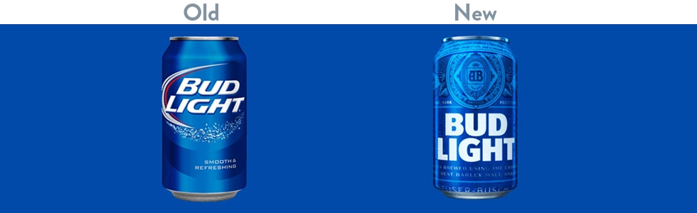
Bud Light went through a complete branding overhaul for the first time in eight years. They stuck with their familiar blue theme, chose a heavier straight-forward font, and added a seal that includes five of the seven continents – it looks like South America and Antarctica didn’t make the cut. Bud Light’s branding updates follow the flat design trend but strayed away from their old logo’s minimalistic design approach by adding much more texture all over the can; exactly the opposite of what U.S. Soccer did with their new logo. Interesting.
#3. Vevo
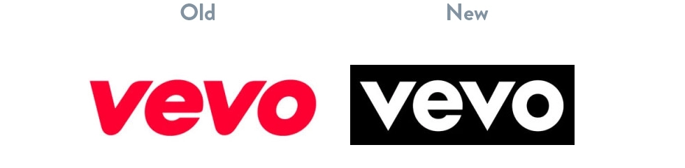
Vevo has become a very popular site for music videos, you’ve likely came across their videos when browsing YouTube. Last year they updated their already minimal and flat logo by removing the italics, changing the font to use very geometric shapes, changed the color from pink to white, and stuck it on a black background. The white on black contrast really makes the logo stand out don’t you think?
#2. Kodak
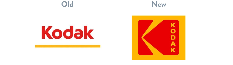
Kodak’s 2016 logo revamp is actually a blast from the past! They went back into their branding archives and updated their logo from 1971; you can see the history of their logo here. Kodak has never strayed from their yellow and red palette, nor have they ever gotten away from a flat design. The new logo is almost an exact replica of their 1971 logo, the only change is the “Kodak” text is now stacked vertically.
#1. AT&T
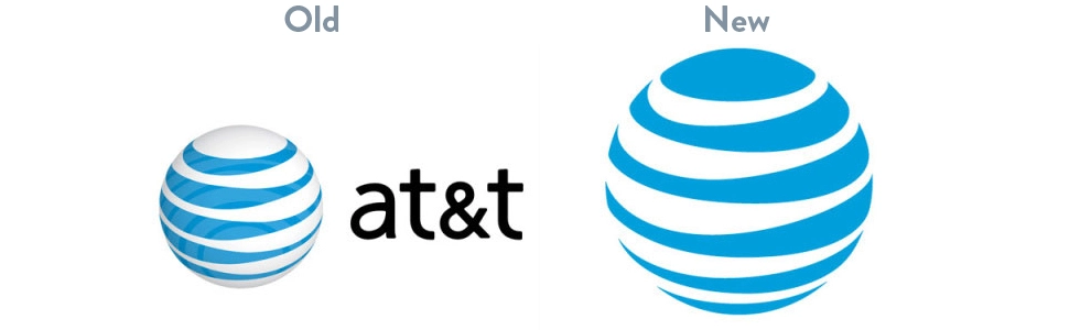
AT&T was established in 1983 and has held on tight to their highly recognizable blue globe logo through multiple logo modernizations. The most recent redesign in 2016 is the most dramatic off all, they dropped “AT&T” all together and are letting the blue globe stand alone. Do you think that you would recognize that logo as being associated with AT&T without the company name listed? Probably.
Is your company in need of a brand refresh? Contact AVIBE to schedule a consultation with our designers and web strategists.
Helpful Web Tips & Tricks
Start Your Project