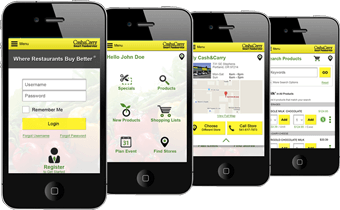
Looks Good on All Devices
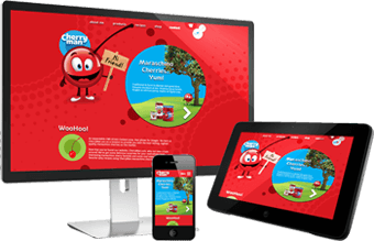
Audience engagement is crucial for any website. A site designed with mobile devices in mind can generate twice the traffic from each user than a traditional desktop-oriented site. One of the best ways to provide a strong mobile presence is to consider responsive design. Responsive design augments the HTML code generated for your site with multiple appearances, each targeted toward a specific platform. AVIBE excels at meeting the challenge of creating multiple cohesive designs for your site to deliver a complete experience across all your favorite web-connected devices.
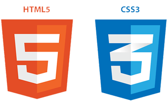
As homes started connecting into the very same broadband backbone as businesses, a beautiful and graphically diverse web flourished. However, as more and more people connected via wireless, new methods had to be made to maintain the fidelity of the web, while dramatically improving the speed at which sites can be delivered to the user. Enter HTML5 and CSS3. With users making the switch to browsers that support these technologies, frequently without even knowing it, they open the door to your site faster than ever before.
Browsers that support HTML5 and CSS3 offer plugin-free audio and video. This eliminates the costly load times and stability issues that can plague third-party solutions. Sites built with HTML5’s latest semantic tags are more easily parsed, understood, and cached by search engines. HTML5 is simpler and easier to maintain, and is supported by CSS3, a collection of enhancements to the graphical presentation layer. Under CSS2, sites featuring rounded corners, gradients, drop shadows, translucent objects, and other effects required dozens of image assets to download from the server. In CSS3, each effect can be generated on-the-fly by the browser itself. CSS3 can also animate elements on the page without ever making a JavaScript call.
97% of clients say our design and deliverables are amazing
99% of clients would recommend us to people/businesses

AVIBE has been fantastic to work with. They help us keep our applications up-to-date with all the latest trends and designs. We could not have picked a better partner to help us get started online and improve our site each year to stay current.
What a difference a day makes! Our new application reduced the time it takes us to process customer applications from four weeks to a week and a half. This technology platform has our company moving at light speed – its really improved our service.
AVIBE is everything we look for in a trusted teammate. Their expert staff is responsive, creative & quick with solutions. Their ability to navigate the online environment allows us to focus completely on our mission. And when the product is finished … it’s a beautiful piece of work!
AVIBE is a critical partner to IMS. I’ve never had a partner that provided as much value as AVIBE in both the level of service we receive and the return on our investment.
Your team was very flexible to meet our time constraints. The entire team was very professional and always available to talk and work through issues. Thank you for such a fluid process and beautiful end product.
Your team deserves a giant high five…with a cherry on top!