July 26, 2021
Provide an effortless and engaging shopping experience
More people are shopping online than ever because it’s typically easier than going to a physical location. The eCommerce convenience factor is encouraging more brick-and-mortar stores to focus on their online storefront; which means users need to have a great user experience to convert “window” shoppers into buyers. The first step in a successful eCommerce site is making sure the user interface is intuitive to navigate and supports every step of the customers’ purchasing journey, all the way through to an effortless check-out process.
Customer Purchasing Journey
There are several steps in a typical shopping journey that every eCommerce site needs to support:
- User enters on the homepage or product category page
- User utilizes an intuitive navigation menu to filter and search for desired products
- User clicks into product detail page to review images, descriptions, pricing, and has ability to customize product and add to cart
- User checks-out
Here are some best user interface practices to provide your customers with an easy and engaging shopping journey.
eCommerce Navigation Strategy
Product inventory can traverse several product levels which can be both overwhelming and difficult for users to navigate. It’s best to stick to one level of product categories to start. Some sites, like Macy’s who we are using as our example site in this post, begin by listing their various departments and then provide the user with additional category filtering options on the department landing pages.
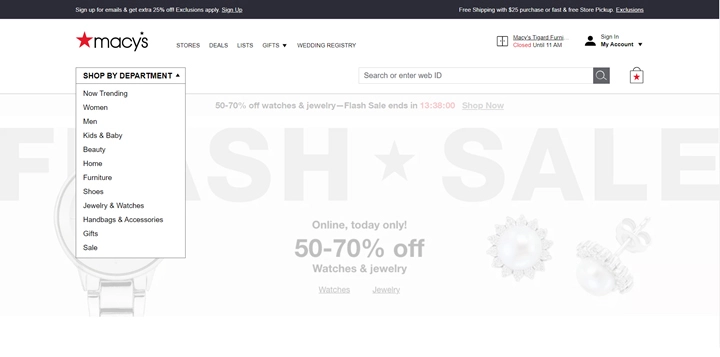
Image Credit: macys.com
Product Category Filtering & Search
Providing shoppers with tools to “choose their own adventure” on their shopping journey is very important. Some online shoppers prefer to search for exactly what they need, while others prefer to browse and filter to until they find their desired products. Both methods need to be available and effective (e.g., product sorting/filtering options on every page, find-as-you-type strategies for product searches).
You can see how Macy’s offers both product filtering on the left side of the screen, as well as find-as-you-type search results for those who prefer to search for a specific product.
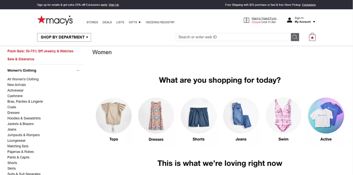
Image Credit: macys.com
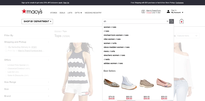
Image Credit: macys.com
Easy Product Customization and Sizing Selection
Macy’s is doing it right when it comes to searching for specific sizes. Users know that the left side of the screen is the place to be for drilling down to the products they want to view and applying their own size filtering. Macy’s also displays available pattern and color swatches below each product where applicable. Users can hover over the swatches to view the different colors and patterns on the product image without having to click into the product detail page – this is great UX.
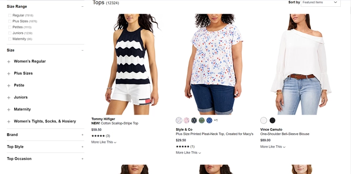
Image Credit: macys.com
Visual Indicators for Sale and Out-of-Stock Products
Visually indicating sales items grabs shoppers’ attention and can encourage quicker conversions. Macy’s consistently calls out sales items by using a red font.
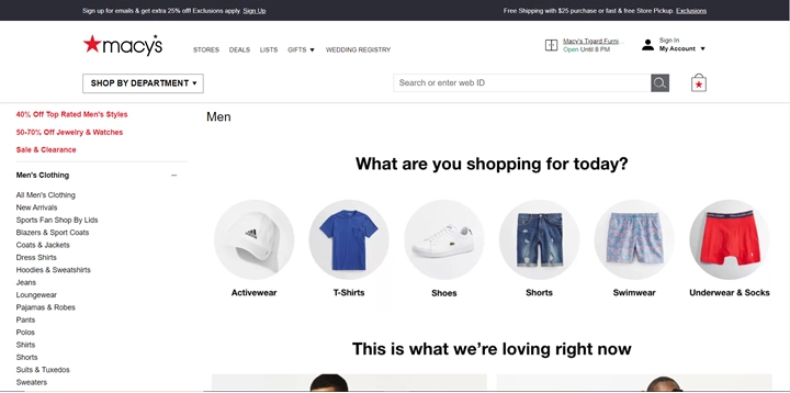
Image Credit: macys.com
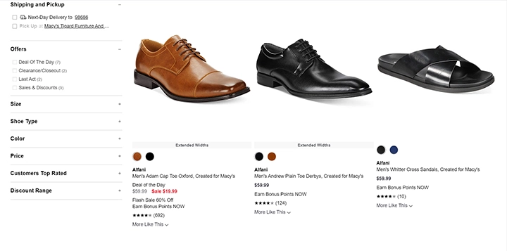
Image Credit: macys.com
There is nothing more frustrating than finding a must-have item and then finding out that the product is out of stock. If the product is out-of-stock, it’s best to clearly note this at product category view. Don’t make users click into the product detail page to find out the item is sold out. If the product has variants, it’s best to clearly indicate what size and color is out-of-stock like Macy’s has done with this shoe. Macy’s has another great feature on the right side of the screen, “Customers also loved”. This is a great way to cross-market similar items if the shopper’s first choice item is sold out.
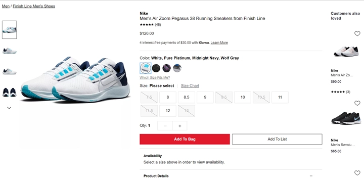
Image Credit: macys.com
Guest Checkout
Check out is where shoppers decide to make their purchase or abandon their cart – the final step in their shopping journey. It’s so important that the check out process is effortless. Some ways that retailers are making it easy for consumers to purchase is by offering a guest checkout option. Removing the barrier requiring users to remember their account credentials has been proven to increase conversions and reduce the number of abandoned carts.
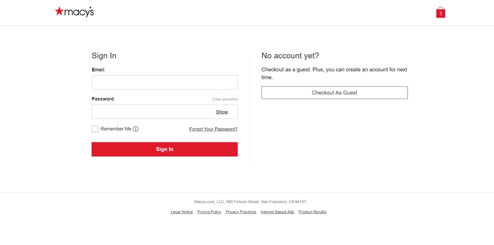
Image Credit: macys.com
What Did We Learn?
We have merely scratched the surface on best UX/UI practices for eCommerce sites by looking at Macy’s site. Many online retailers are venturing more and more into artificial intelligence and machine learning strategies to help increase conversions through personalization. We will talk more about this in a future blog post.
Today, we hope to leave you with various UX/UI strategies to support your online conversions and reinforce the most important takeaway…
Avoid buyer barriers. Your eCommerce site needs to engage and support users, not distract from a streamlined customer journey. There are lots of bells and whistles that can be tempting to include in your UI but can ultimately deter users and cause them to stray off the beaten buying path.
Helpful Web Tips & Tricks
Start Your Project