January 7, 2019
Branding is the first impression you make and first opportunity you have to “speak” to your target audience. First impressions are key in building trust with your customers and one of the first things people see is an organization’s logo; this is why it is so important to make sure your brand and logo remain modern and continue to “speak” to your customers.
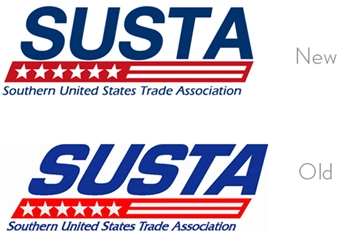
We recommend that businesses revisit their branding strategy and guidelines every 2-3 years to remain modern. By no means do you need to fully rebrand that often, but you need to be aware of what message you are conveying to potential and existing clients. Simple updates can be made each year to make sure your business’ branding does not look dated – check out this logo modernization our design team created for our client upon redesigning their website. It is very clean, simple and still completely recognizable by making only small font and color changes.
Rebranding efforts can range in scope – minimal updates to a full overhaul if needed. If you are considering rebranding or refreshing your logo design in 2019, here are some trends you can expect to see.
10. Monochromatic
Monochromatic logo design uses one color. By no means does this result in a boring design. The different shades, tints and tones of one selected color can vary greatly; they can emulate depth and texture, and they can be complicated or simple. Often times a logo will have a one-color version, even if that isn’t the preferred version of the logo. This approach lends itself to greater flexibility when designing branding elements.
www.portlandmonthly.com
www.mastercard.com
9. Perspective
Using perspective in interesting ways is becoming more popular and will continue in 2019. The visual interest behind this approach is very engaging when executed effectively; playing with distortion adds originality to the design. Outside of adding interest, perspective can give a logo greater impact. For example, a construction company that specializes in road construction has an “A” as their logo; this wouldn’t typically stand out but utilizing perspective can merge the shape of a road going over a hill with the letter “A” and their logo would then provide insight into what the company does.
Logo by Landon Cooper
www.dropbox.com
8. Bright Colors
Bright and vibrant use of color in logos will continue to be seen in 2019 as businesses and organizations are using color to communicate in different ways. Color can communicate the brand story to the users through color. Bright colors are fun and eye catching, but can also be used to influence customers.
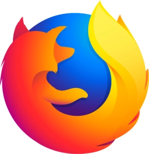
www.mozilla.org
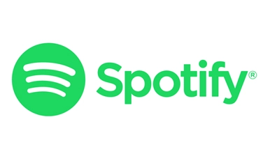
www.spotify.com
7. Negative Space
The use of white and negative space is not a new design concept and we will continue to see it trending in 2019. Using negative space in a creative way can greatly enhance the logo’s uniqueness and add a new level of visual interest to the design. Negative space may not be discernable at first glance but can add another layer of meaning that would not be possible to communicate otherwise.
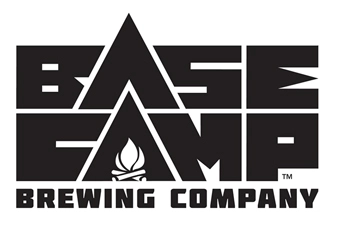
www.basecampbrewing.com
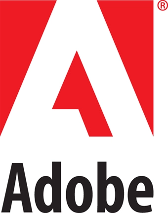
www.adobe.com
6. Simple Typography
Minimalistic type design will continue to trend in 2019. One driver of this could be the continued growth in use of mobile devices; screen real estate is crucial and the content should not be shadowed due to the placement of a large and complex logo design. We have seen many companies move from a complex typeface to a simple sans-serif font to support the growing number of consumers shopping and living online. Sans-serif font is easy to read and lends itself well on mobile devices. Simple text-only logos display well on all devices and they also translate well for implementation on print media materials.

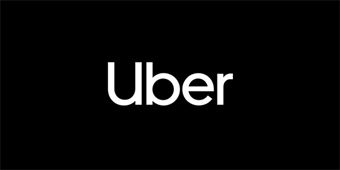
www.uber.com
5. Illustration
In 2019, we will see more logo designs that include illustration in creative ways. Illustration is fun, unique and depictive – it can be used to communicate your organization’s services, expertise or mission visually. When done well it can make your logo instantly recognizable. Illustrative logos can be complicated or minimalistic and provide a more natural feel of a brand. Illustrative logos can work well when paired with hand-drawn typography to create a unified illustration.
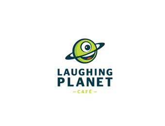
www.laughingplanet.com
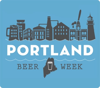
www.portlandbeerweek.org
4. Gradients
Gradients have been trending throughout 2018 and will continue to do so in 2019. The smooth transition between colors both cool and warm adds interest to a simple design and the use of color attracts the eye.
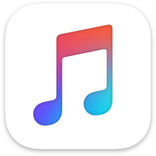
www.itunes.com
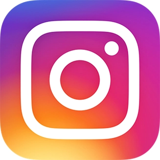
www.instagram.com
3. Geometry and Iconography
Text or simple designs can be elevated using geometric shapes to help communicate who the organization is. These shapes can be playful and intricate or bold and simple and still be effective in their own way. Iconography is typically seen next to or above the logo but are often used as a standalone representation of the company which is convenient for scaling a logo down for smaller screen sizes.
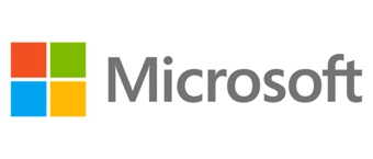
www.microsoft.com
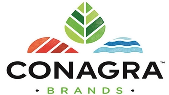
www.conagra.com
2. Hand Drawn
Hand drawn logo trends are on the rise and expect to see more in 2019. Hand drawn design typically includes detailed design work that supports hand drawn typography; this can still appear to be minimalistic when done right. Unique, hand drawn designs allow the company’s originality to come out and make your business stand out from your competition.
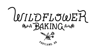
www.wildflowerbakingpdx.com
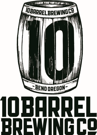
www.10barrel.com
1. Cut Typography
Cut typography takes fonts to the next level by cutting away portions or sections of text to create added visual interest to a rather simple font. This approach to typography is readable even at a quick glance; the human brain is amazing at filling in the gaps. Is can create secondary iconography that can be utilized as a standalone component for the brand or mimic the icon to create a unified design.
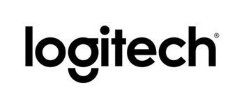
www.logitech.com
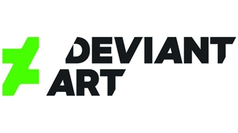
www.deviantart.com
Each of these logo design trends translate well on their own, but if you look closely you will notice an overlap or hodge-podge of trends in some of the examples we shared; like the use of bright color and gradients, or the use of monochromatic black text paired with negative space. These are only a few logo design trends that we expect to see but we also expect to see new concepts that evolve in 2019 that we haven’t seen yet – these could be completely new approaches or a compilation of the trends we mentioned. Either way, we are excited to explore some of these logo trends in 2019. Which 2019 logo design trend is your favorite?
Helpful Web Tips & Tricks
Start Your Project